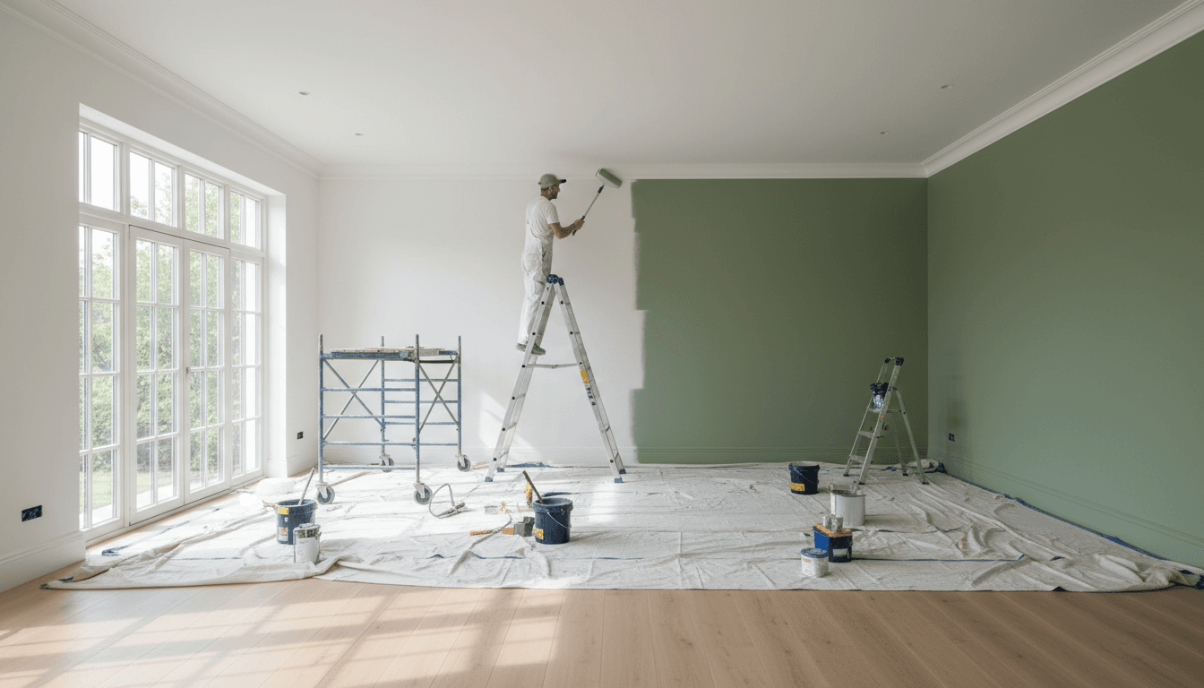
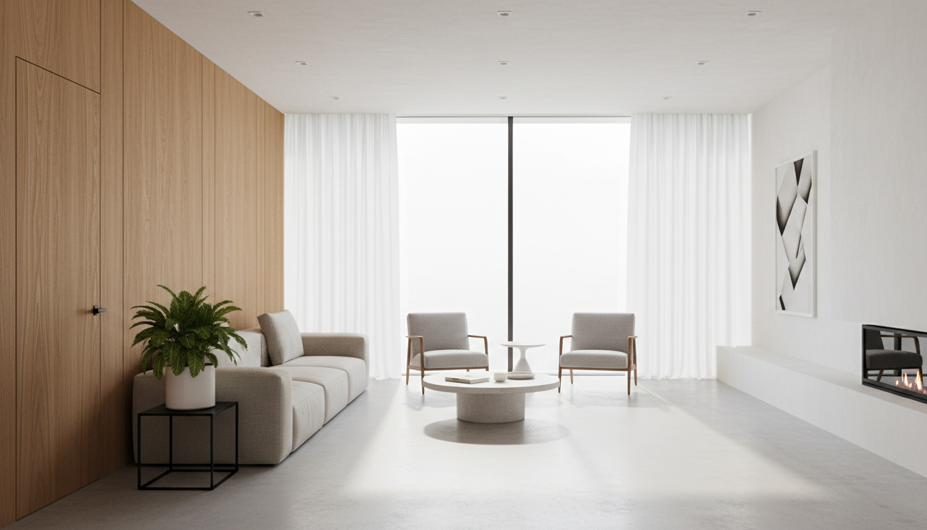
The most prominent interior paint color trends 2026 feature warm, nature-inspired palettes like earthy greens, deep blues, and organic neutrals. Homeowners are gravitating toward mushroom taupe, soft greige, and chocolate brown to create moody yet welcoming environments. These shades provide a timeless aesthetic that balances modern style with increased property value.
Selecting the perfect interior palette often feels like a gamble, especially when yesterday's trendy grays now feel cold and uninviting under the unique Chicago light. For many local homeowners, the frustration lies in a space that lacks character despite a fresh coat of paint. At Tre Residential Painting LLC, we understand that your home requires a sophisticated balance of style and functional beauty. In 2026, we are seeing a definitive shift toward organic warmth and moody, immersive depths that breathe life into Midwest interiors. This guide explores the latest color forecasts from industry leaders like Benjamin Moore and Sherwin Williams. You will discover how to navigate the specific challenges of Lake Effect skies; we will also detail which colors maximize your home's resale value and the technical secrets behind the rising trend of color drenching for a truly flawless finish.
The Shift Toward Warmth: Why Cool Grays Are Being Replaced in 2026
The design landscape in Chicago is undergoing a significant correction. For nearly a decade, cool, blue toned grays dominated everything from Gold Coast condos to Naperville new builds. However, the interior paint color trends 2026 reflect a decisive move toward the Warm Minimalist aesthetic. Homeowners are trading the sterile, clinical feel of Millennial Gray for palettes that prioritize comfort and organic textures. This shift is driven by a desire to create sanctuaries that feel grounded and tactile rather than sharp and industrial.
In our experience providing professional interior painting services, we see this transition most clearly in how clients respond to Chicago's unique natural light. During the long, overcast winter months, cool grays can feel flat or even depressing. To counter the harsh lake effect light, many are opting for Universal Khaki or the clay like depth of Reddened Earth. These shades introduce a much needed warmth that remains sophisticated without feeling dated or heavy. These colors react beautifully to the shifting Midwestern sun, maintaining their richness even on the grayest January afternoons.
Current high end projects in luxury high rises and suburban estates are moving away from monochromatic starkness in favor of layered neutrals. Instead of one single shade of gray, we are seeing a preference for mixing mid tone taupes, soft beiges, and muted mushrooms. You can see examples of these richer, more complex palettes in our gallery of recent projects. This layered approach adds visual weight and architectural interest, making large rooms feel more intimate and inviting while still maintaining a clean, modern edge.
Benjamin Moore and Sherwin Williams 2026 Predictions for Midwest Homes
Building on this demand for warmth, the major paint manufacturers have released forecasts that lean heavily into saturated, complex pigments. Benjamin Moore has highlighted Silhouette AF-655 as a cornerstone for 2026. This color lives in the intersection of deep charcoal and burnt umber; it provides a grounded, architectural feel that lighter grays simply cannot replicate. In the historic homes of Oak Park or Lincoln Park, Silhouette works exceptionally well as a backdrop for heavy, original woodwork. It does not fight against the dark oak or walnut common in these neighborhoods. Instead, it provides a sophisticated, moody canvas that makes antique finishes and ornate moldings stand out with renewed clarity.
The HGTV Home by Sherwin-Williams 2026 collection follows a similar path toward depth and personality. Their highlighted palette includes colors like Still Water, a dense teal with gray undertones, and Cordovan, a rich, equestrian inspired brown. These shades are particularly effective in Chicago’s traditional dens or formal dining rooms where homeowners want to create a sense of heritage and permanence. To prevent these saturated tones from becoming overwhelming, they are often paired with Lemon Chiffon, a soft, creamy yellow that acts as a modern, warm alternative to the stark white trim of the past decade.
Applying these specific interior paint color trends 2026 requires a high level of precision and surface preparation. Saturated colors like Cordovan or Still Water have a high pigment load, which can show lap marks or roller textures if not applied by an experienced hand. Our team often recommends these palettes for clients who want to emphasize the unique craftsmanship of their property. You can read more about our experience handling these complex, high pigment finishes in our interior painting customer reviews. By choosing these rich tones, property owners can bridge the gap between 19th-century Chicago architecture and 21st-century style, creating spaces that feel both historic and current.
Chicago Lighting: How Lake Effect Skies Influence Paint Selection
Chicago winters are notorious for their relentless overcast skies and lake effect clouds. This specific quality of light is cool and blue-toned, which can wreak havoc on certain pigments. When we provide professional interior painting services, we often warn clients that a beautiful sky blue or a crisp light gray can look uncomfortably icy or flat once November arrives. These cool tones lack the depth to stand up to the dim, diffused light coming through the windows, often making a room feel colder than it actually is.
To combat this, the interior paint color trends 2026 emphasize "Chameleon Colors." These are shades with complex undertones that shift based on the time of day and the quality of light. Soft greiges and mushroom taupes are excellent choices because they contain enough warmth to feel inviting on a snowy afternoon, yet enough coolness to look modern under the summer sun. These mid-tone neutrals provide a necessary visual anchor that prevents a space from feeling washed out when the natural light fails.
Maintaining brightness is crucial when daylight hours are short. We suggest moving away from stark whites in favor of warm whites with subtle cream or linen undertones. These whites reflect light effectively, keeping a space airy, but they lack the sterile edge of pure white. This approach ensures that your home feels bright and energetic during the grayest Chicago months without losing that sense of organic comfort. You can see how these tones interact with different architectural styles in our gallery of recent projects.
ROI Colors: Interior Paint Trends That Increase Home Value in 2026
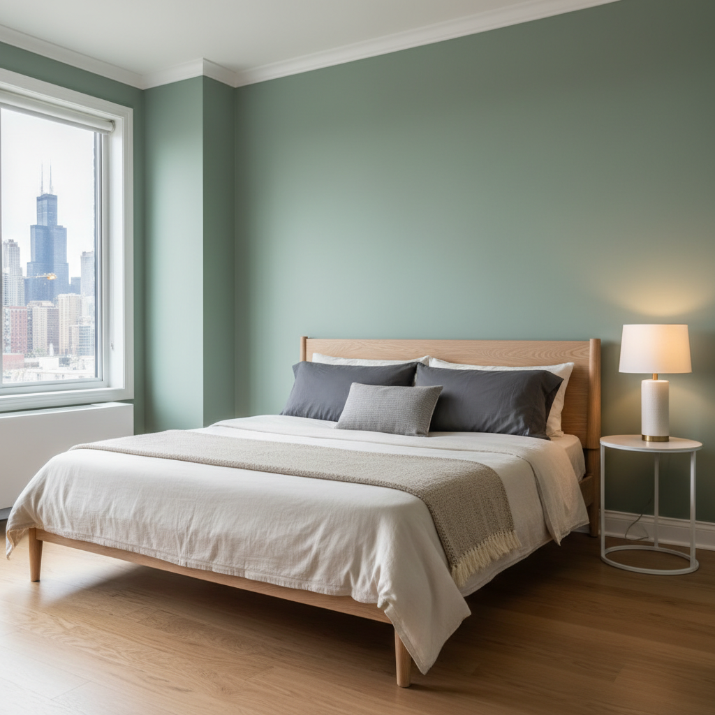
For real estate investors and realtors in the Chicago market, selecting the right palette is a strategic financial decision rather than a purely aesthetic one. Data from Zillow and Opendoor indicates that specific interior paint color trends 2026 are already influencing buyer psychology and closing prices. For instance, homes featuring pale blue living rooms often command a premium, as the color creates a sense of airy tranquility that appeals to a wide demographic. Similarly, sage green bathrooms have become a high-ROI choice, evoking a spa-like atmosphere that suggests luxury and cleanliness.
When looking at higher-end renovations, a new luxe standard is emerging in functional spaces. Charcoal gray is increasingly preferred for kitchens, providing a sharp, modern contrast against stainless steel appliances and stone countertops. In primary bedrooms, chocolate brown is gaining traction for its ability to create a sophisticated, cocoon-like environment. These deeper tones suggest a level of custom design that can justify a higher asking price.
Room Type | Trending ROI Color | Impact on Perception |
|---|---|---|
Living Room | Pale Blue | Airy, expansive, and calming |
Bathroom | Sage Green | Relaxing, spa-like, and clean |
Kitchen | Charcoal Gray | Modern, high-end, and grounded |
Bedroom | Chocolate Brown | Cozy, sophisticated, and luxurious |
Despite these specific winners, property managers and realtors seeking a fast turnaround should still lean on a foundation of neutrals. Soft-greige interiors remain the safest bet for mass appeal because they provide a blank canvas that complements diverse furniture styles. When we provide professional interior painting services for pre-listing updates, we often recommend these versatile neutrals to ensure the home feels fresh and move-in ready without alienating potential buyers. Reviewing a gallery of recent projects can help investors visualize how these ROI-focused colors look in real-world Chicago floor plans before committing to a full renovation.
The Rise of Color Drenching and Moody Accent Walls
Beyond selecting the right hue, the method of application is evolving to create more immersive environments. A dominant technique within the interior paint color trends 2026 is color drenching. This approach involves painting the walls, trim, doors, and even the ceiling in the same color. By eliminating the traditional white contrast of baseboards and crown molding, you remove the visual breaks that usually define the edges of a room. For owners of smaller Chicago apartments or garden units, this lack of interruption makes a space feel significantly larger and more cohesive rather than chopped up by different finishes.
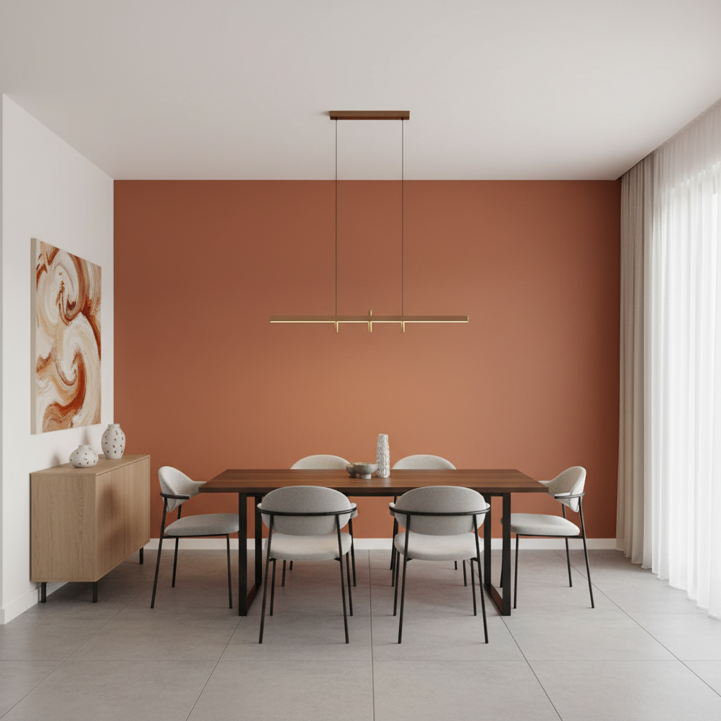
While drenching provides a high end, seamless look, moody accent walls are also seeing a resurgence to provide structure in modern open-concept floor plans. Instead of the bright, neon accents of the past, 2026 is defined by deep forest greens and sunset-inspired tones like terracotta and clay. These colors add immediate architectural depth to a room, serving as a grounded focal point that complements natural wood furniture and organic textures.
Successfully executing these techniques requires meticulous surface preparation, as dark, saturated pigments will highlight any imperfections in the drywall or woodwork. When we provide professional interior painting services, we ensure that the transition between different surfaces is flawless, maintaining the sophisticated feel that color drenching intended. To see how these deep tones and seamless finishes look in local homes, you can browse our gallery of recent projects for inspiration.
How to Choose the Right Paint Finish for a Flawless Chicago Interior
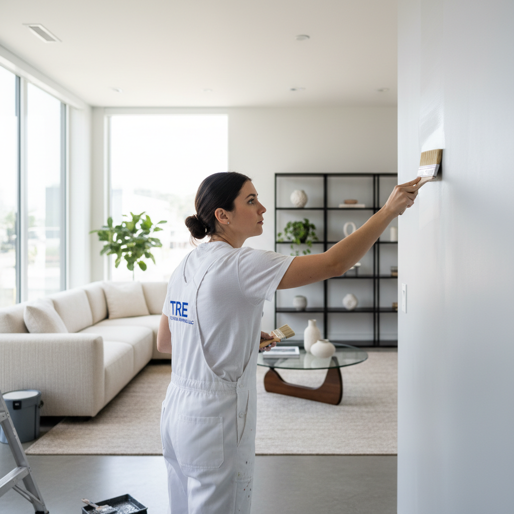
Selecting the right sheen is just as critical as the hue when navigating interior paint color trends 2026. While high-gloss was once a staple for trim, the current aesthetic favors the muted, velvety look of matte and flat finishes. Matte paints are excellent for hiding the minor plaster cracks and wall imperfections often found in Chicago’s vintage housing stock. However, homeowners with young children or active pets should weigh this aesthetic against day-to-day durability. In high-traffic hallways or mudrooms, an eggshell or satin finish remains the superior choice. These sheens provide a subtle luster that resists scuffs and allows for easy cleaning without buffing away the paint itself.
Finish | Recommended Use | Key Benefit |
|---|---|---|
Matte | Dining Rooms, Master Bedrooms | Hides imperfections; rich color depth |
Eggshell | Living Areas, Bedrooms | Low sheen; wipeable and durable |
Satin | Kitchens, Bathrooms, Hallways | Moisture resistant; stands up to scrubbing |
Environmental responsibility is another major factor for many Chicago residents. We increasingly utilize low-VOC and zero-VOC paints to ensure that indoor air quality remains high during and after the project. This is especially important during the winter months when windows remain closed and ventilation is limited.
Achieving a flawless look with the trendy, saturated dark colors of 2026 requires specialized technique. Dark pigments are notorious for flashing, where uneven application creates shiny patches or visible streaks. Our professional interior painting services focus on maintaining a wet edge and using high-quality tools to ensure a uniform, high-end finish. You can see the results of this precision in our gallery of recent projects, where deep, moody tones appear seamless across large surfaces. Proper sheen selection, paired with expert application, ensures that your home doesn't just look on-trend, but stays functional for years.